Balanced
Stand Apart
Custom Tennis Racquet Manufacturer
The Project
Balanced website design for
Custom Tennis Racquet manufacturer
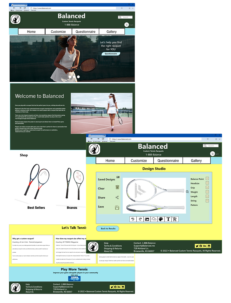
Balanced is the first truly customized tennis racquet manufacturer and certified retailer without a minimum order. Our mission is to match players with a racquet that feels like an extension of their body.
Balanced gives players the power to stand apart and allows them to showoff their game and personality. Players can build a racquet with specs and a look that is perfect for them or personalize their perfect racquet from one of their favorite brands.
Project Duration
May- June 2022
My Role
UX Design Lead
My Responsibilities
Conducted interviews. Created paper and digital wireframing, low and high-fidelity prototyping.
Conducted the usability studies. Accounting for accessibility and iterating on designs.
The Challenge
Pre- built racquets don’t always have the perfect specs for everyone. Lots of players find themselves saying, “if I could tweak this racquet just a bit, I could really optimize my play on the court.” Players need a way to get a racquet that’s a perfect balance for them.
The Goal
To design a website where players can build a custom racquet that will compliment their style of play and improve their game, and as a bonus, express their individuality on the court.
Understanding the user
-
User research
-
Pain Points
-
Personas
-
Problem Statement
-
User journey map
User Research
I conducted a competitive audit, and interviews of players. Created empathy maps to understand the users I’m designing for and their needs. A primary user group identified through research were tennis players ages 16- 63 and coaches ages 23-54.
This user group expressed how important it is for a player to have a racquet that’s right for them. That if they have to switch racquets during a match, they don’t want to notice a difference in the balance or weight. Participants explained that changing the overall racquet weight, moving their racquet’s balance point, and/ or adjusting the swingweight have a direct impact on a player’s control, power, or ability to execute various shots, so it’s important to keep it consistent.
A couple of participants shared why aesthetics is important to them. They shared that some tennis clubs have relatively strict dress codes, such as requiring that everyone on their courts wear white and that the ability to change the appearance of their racquet gives them some room for personal expression without violating the rules.
The Problem
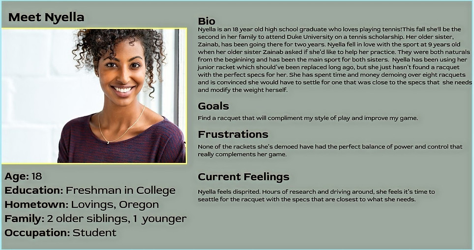
Nyella, an 18 year old college freshman, needs a custom racquet because it will compliment her style of play and improve her game.
User Pain Points
Length
Users want to be able to adjust the length of their racquets based on their height and wingspan.
Weight
Users want to be able to change the overall weight of the racquet to add power or stability to their swing and to reduce vibration when they hit the ball.
Aesthetics
Users want to be able to express their personality through their racquets.
Swingweight
Users want the ability to control the inertia that the racquet generates as they swing.
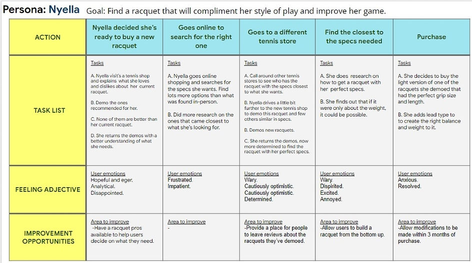
Nyella's Journey
Starting
the design
-
Sitemap
-
Paper wireframes
-
Digital wireframes
-
Low-fidelity prototype
-
Usability studies
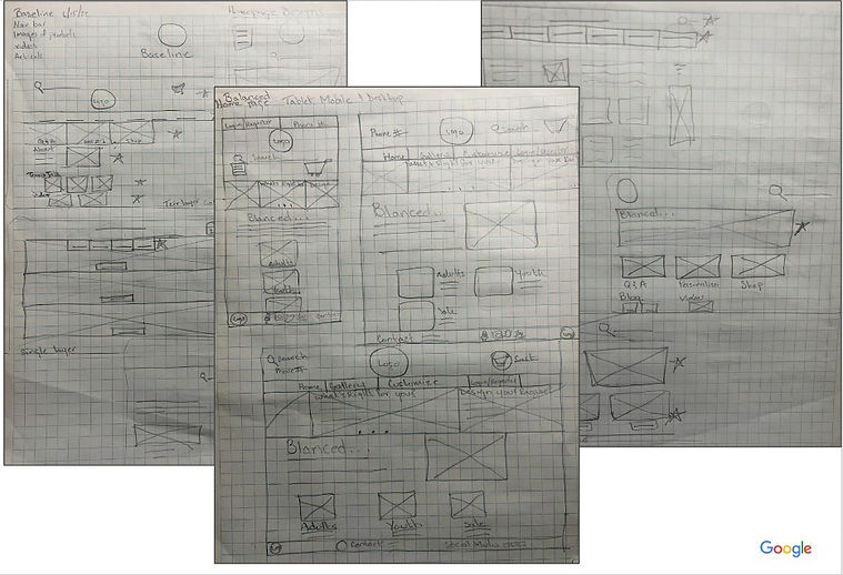
Paper Wireframes
Responsive Screens
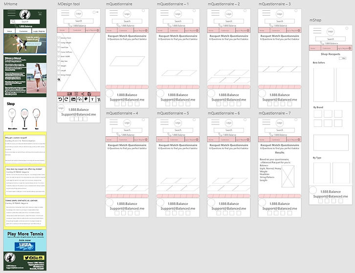
I included considerations for mobile screen sizes in my mockups based on my earlier wireframes. Understanding that users shop from a variety of devices, I felt it was important to optimize their browsing experience by including mobile wireframes to allow users a convenient option.
Usability Study: Parameters
Study Type:
Unmoderated usability study
Participants:
7 participants
Location:
Kirkland, WA- In-person
Length:
20 minutes
Usability Study Findings
I conducted two rounds of usability studies. Findings from the first study revealed that the simple IA was perfect for users to intuitively navigate through the website. The second study used a high-fidelity prototype and made me focus on refining the paths users were taking to complete their task, rather than the bonuses added to the mockups, such as the blog and gallery.
Gallery
0 participants clicked on gallery during the usability study. This allowed me to focus on the paths important to the user.
Design Studio
7/7 of the participants tried to design their racquet. This further cemented the idea that there is a need for a site such as Balanced.
Blog
0 participants clicked on the blogs page when it was it’s own tab, but when I moved it to the home page, most participants read or scanned through it.
Refining
the design
-
Mockups
-
High-fidelity prototype
-
Accessibility
Refining the design
I wanted the options on the navigation bar to be useful to my users, so I refined the menu options to reflect the options that were important to the participants.
I placed the Blog section on the homepage where users are more likely to engage with it. I also rearranged the header for a more balanced and organized look. I added a carousel to have more options for navigating.
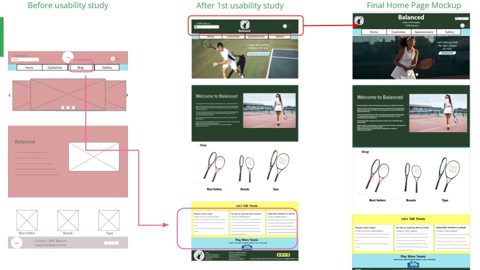
v.5 Mockups

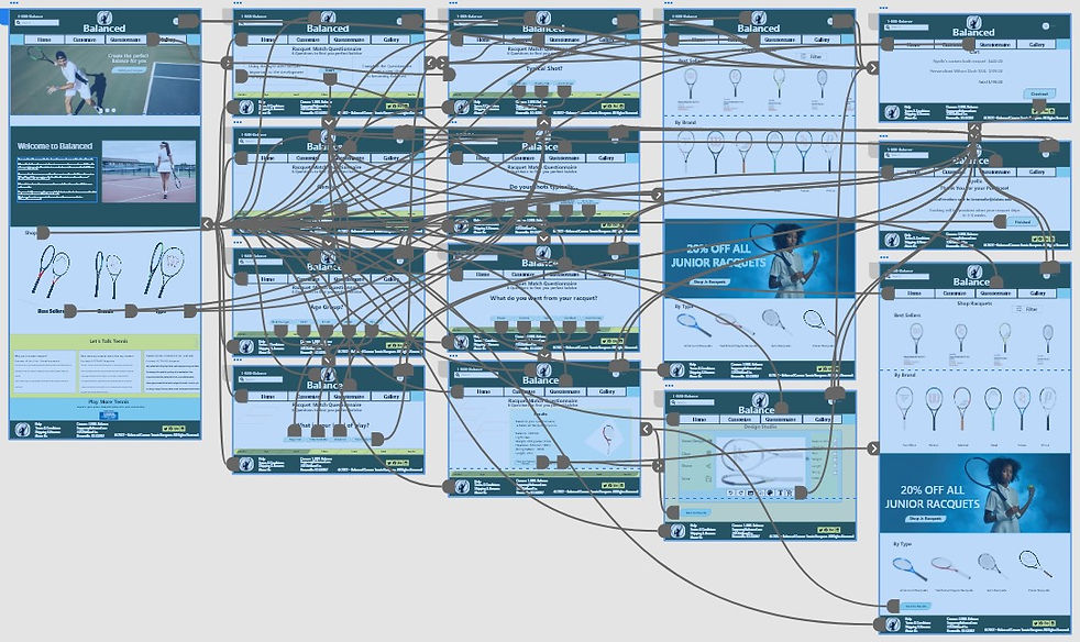
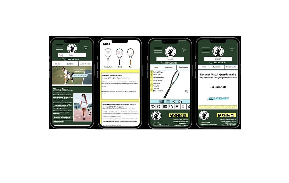
Final version responsive mockups
Accessibility Considerations
1
I used colors and backgrounds that passed the WCAG color contrast checker.
2
I used landmarks to help users navigate the site, including users who rely on Assistive Technologies.
3
I used headings with different sized text for clear visual hierarchy.
Going
foward
-
Retrospective
-
Next steps
Retrospective
Balanced was an incredibly fun project to work on. I’m thankful to have been given a random project that I personally care about because it really challenged me to not build for myself.
Working with Adobe was a learning curve, but similar enough to Figma that it was an easy acclimation.
Interviewing people I know as participants was not easier as I had initially thought it would be. The conversations went off track very often, and I sometimes felt awkward saying no to some design suggestions made by the participants.
Moving forward, I would like to develop more wireframes of this app. I would also like to complete developing the mobile version to allow for a fully responsive website. I had a lot of fun with this project, and I don’t plan for it to end here.
Next Steps
1
Develop more wireframes for this app. Such as the checkout process and shop racquets page.
2
Design the entire website for both mobile and tablet so that the entirety of the site is fully responsive.
3
Conduct follow-up usability testing on the new website to make sure we have met the needs of users.
"Every champion was once a contender that refused to give up."


